Are you a tour operator, travel agency or tourist office looking to improve your digital communications?
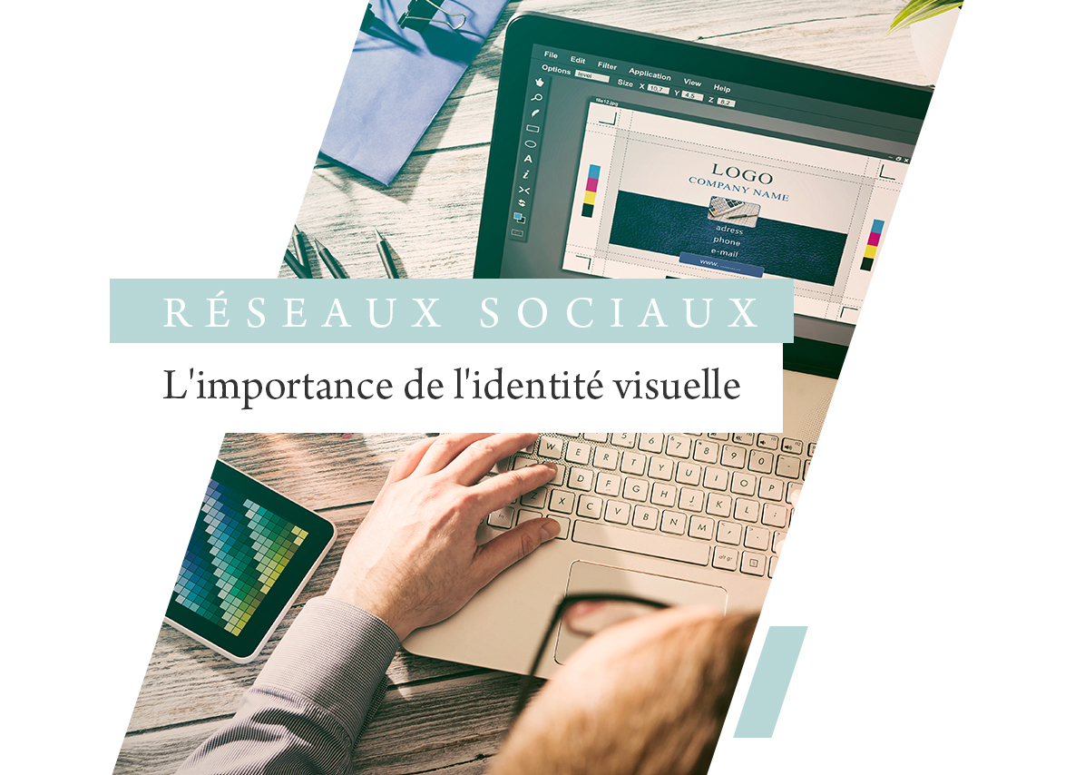
First and foremost, good communication relies on a coherent, well-implemented visual identity.
Discover our advice on the importance of your visual identity on social networks.
It’s important that your brand and values are reflected on your social networks, as this will impact the image you project to your targets.
In fact, this is the basis of your digital communication.
The challenges of visual identity for a tourism company
First things first: do you know exactly what a visual identity is?
It’s made up of various elements that help identify and recognize your brand, your product/offer and your values.
It’s vital to take care of your visual identity, as it represents your business card on social networks.
These different elements will define your values and your DNA as a brand.
Indeed, it’s the first thing people notice when they visit your Facebook page or Instagram account.
It’s therefore essential to take care of your profile photo, and we recommend placing your logo or part of your logo (the most recognizable) on it.
But also your cover photo, where you can create an original visual or place a video while respecting your graphic charter and the requested format.
 Having a strong visual identity will also enable your brand to build community loyalty.
Thanks to your visual codes, it will be possible to create a feeling of belonging and attachment on the part of the community, notably through the values transmitted.
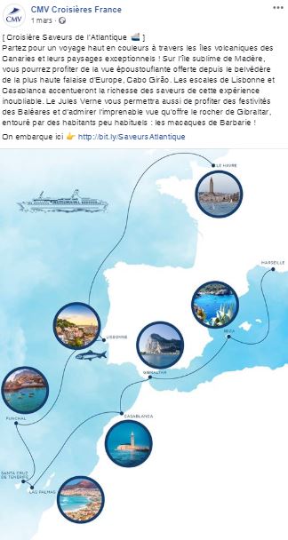
Example of an effective brand identity: CMV – Maritime cruises & travel
For the CMV brand, we developed a communications strategy around their cruise ship: the Jules Verne.
For example, we redesigned the ship as an engraving to be used on several Facebook post templates in the blue of the cruise line’s graphic charter.
The latter is recognizable and signs CMV’s posts without recalling the logo.
It’s also your trump card when it comes to standing out from your competitors.
With your brand’s own graphic codes, you’ll be easily identifiable on social networks.
All this will build your credibility with your community, customers or prospects, and affirm your professionalism,
When it comes to your identity, it’s important to follow trends and not wait until you have an outdated visual identity, without plunging into cliché.
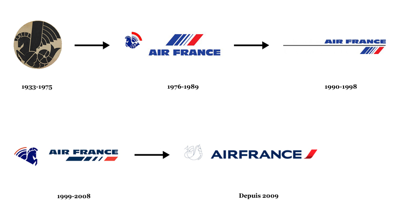
As you’ve probably noticed, many brands evolve their identity over the years, whether it’s just a facelift (simplification or modernization of the pictogram, change of color or typography) or a complete overhaul of the identity, to match changes in the brand’s positioning for example.
However, it’s important to be cautious about any change, however slight.
Some loyal customers may be wary of changes.
Note, however, that a visual identity has a lifespan of around ten years.
The case of the Air France logo, its evolution from 1933 to the present day:
 Creating a logo for a travel agency or tour operator:
Let’s take a closer look at the importance of a logo for a travel company.
A logo is an indispensable tool, the first step in a communication strategy.
There are two ways to create your identity: On the one hand, you can call on a freelance graphic designer or a communications agency.
They’ll follow your instructions on the type of identity you want for your travel agency or tour operator, and take care of the design.
It’s up to you to decide which solution is right for you, taking your budget into account.
 The first step is fundamental, and requires you to ask yourself the right questions: What text will appear on your logo?
Are you looking for a simple or complex logo for your brand?
What values do you want the logo to convey?
What style best suits your brand?
(classic, modern, luxurious, fresh, flashy…)?
All this information is important, and should be included in your specifications or creative brief.
They will help guide your future logo towards a certain design.
Then comes the actual graphic design stage.
This involves choosing tones, selecting icons, adding effects, creating a few logo prototypes, and any necessary retouching.
The choice of logo colors is strategic, in fact each color has a meaning, for example a logo in black or gray tones will evoke sobriety, elegance while a logo with bright colors will evoke more cheerfulness.
You can choose a solid-colored logo, the choice made by 59% of brands between 2018 and 2019.
As for the choice of typography, it’s also fundamental, as it too will have an impact on visual identity.
Each typeface evokes different values: serif, handwritten, calligraphic,
Make sure the logo is consistent with your company and your values.
In short, the logo must be: simple, original, adaptable and durable.
Simple: it must not be overloaded or confusing, because it must be easily recognizable and memorable.
Original, because it must stand out from the competition, but be careful not to isolate itself.
It must be adaptable, of course, as it will be used on a variety of communication media.
The analysis of the brief should then enable us to develop leads with the research phase.
Finally, the final approval of the logo is decided by the whole team.
There are 3 clear stages in the creation of a logo: creative brief, reflection and development of ideas, and refinement.
For the travel agency specializing in the United States, Évasions USA, we chose to create a round logo, and to be relevant to the company’s activity and values, we featured the Golden Gate Bridge.
As for the choice of colors, we strategically opted for orange, reminiscent of stretches of desert, and blue, the symbolic color of the U.S. flag.
For both travel agencies and tour operators, the logo is a key element of the communication strategy.
In fact, it’s a distinctive sign that will appear on all communication platforms, every time the company is mentioned: on the website, on business cards, or even on sales brochures.
This visual is a way of being recognized in a matter of seconds by customers and partners.
Setting up a graphic charter for the trip:
The logo and other graphic elements will then form a document that will be your company’s graphic charter.
An essential tool for your digital communications, it defines the rules for using your visual identity.
On social networks, as a company in the travel sector, the editorial line is very important, but just as important as the graphic charter.
For example, the visuals accompanying posts on social networks such as Facebook or Instagram will be a real promotional or sales tool for your company.
Your graphic charter must therefore be well thought-out and correctly applied.
What exactly does it contain?
- Logo
- Colors
- Typography(s)
- Pictogram(s)
Creating your company’s own, coherent graphic charter will be a real added value, and will save you time in the future when creating your visual media for social networks.
What’s more, each network has its own codes and formats, so don’t forget to adapt your graphic charter to each one.
As you’ve already seen, a unique and original visual identity will leave a lasting impression and encourage consumers to find out more about your offer.
A well-designed logo, a relevant graphic charter and attractive visuals will therefore naturally improve your image and brand awareness, and help boost your sales.
